Financial Advisor Website Design: Building a Site That Converts and Stays Compliant
Learn how financial advisor website design builds trust, supports compliance, and turns visitors into leads, plus how to choose custom or template.
Updated: 10/20/2026 by Cullen Fischel

Your website's real job is generating clients, not just describing your firm
A financial advisor website that only lists services and staff bios is doing a fraction of its potential work. Prospective clients now research firms extensively online before they ever pick up the phone, which means good financial advisor website design has to do more than look professional. It has to build trust, stay within the compliance boundaries advisors operate under, and move visitors toward booking a conversation.
This guide covers how to design or commission a site that handles all three jobs, and how to decide whether a custom build or a template platform fits your firm better. None of this replaces a conversation with your own compliance or legal team. Rules around testimonials, performance claims, and recordkeeping vary by registration type and firm policy, so treat the compliance material here as general awareness, not legal guidance.
Key points covered in this guide:
- Why conversion-focused design has become a competitive requirement, not an upgrade
- The trust psychology specific to financial decisions, and which credibility signals matter most
- Compliance-adjacent considerations around testimonials, disclosures, and recordkeeping
- The tradeoffs between custom-built sites and template platforms
- How to treat your website as an ongoing lead generation system rather than a one-time project
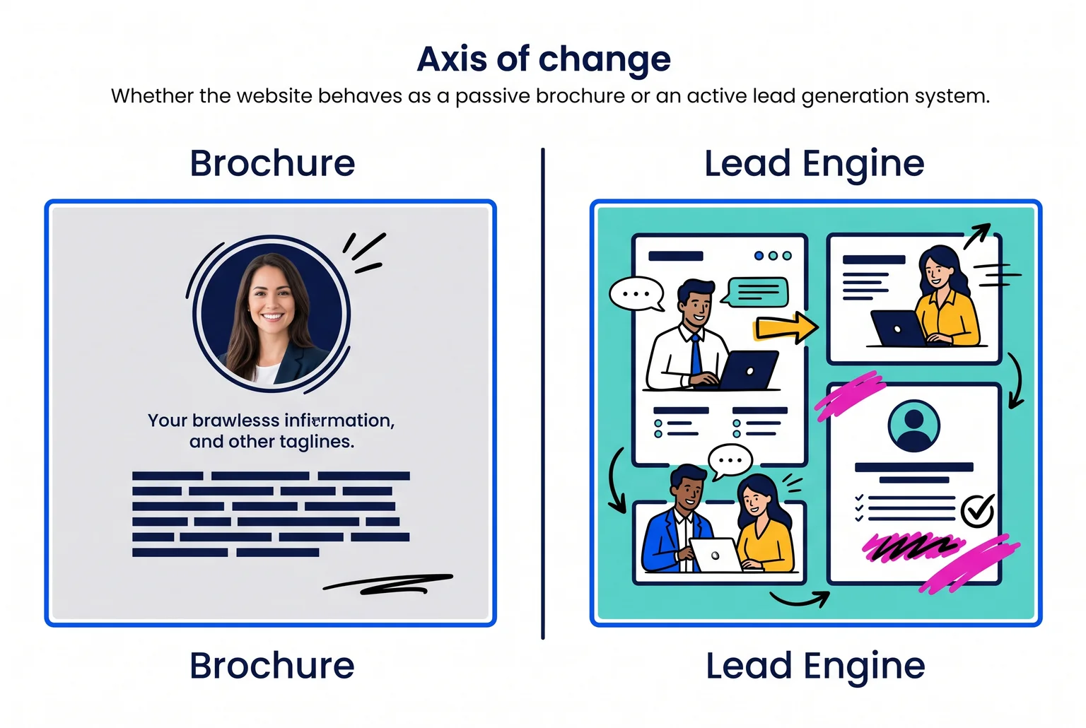
The sections ahead walk through each of these in turn, starting with why conversion design has stopped being optional for advisory firms competing for the same prospects online.
How prospects vet advisors before ever picking up the phone
Referrals still matter, but they no longer explain most of how advisors get hired. Ficomm's 2024 Consumer Insights Study found that only 29% of consumers who hired an advisor said a personal referral was required, while 45% chose their advisor based on digital marketing. Among consumers under 44, that figure climbs to 57%, compared with 20% for those 60 and older.
That pattern shows up in how people prepare before ever contacting a firm. Ficomm's research lists the specific steps prospects take: a Google search (18%), reading Google reviews (16%), visiting the advisor's website (15%), searching "top advisor" lists (13%), and downloading a free report from a site (9%). A 2024 Federal Reserve Bank of Philadelphia report reached a similar conclusion from a different angle, finding that financial websites are the second most common source of financial advice, used by 23.7% of respondents, behind only professional advisors themselves.
Many firms haven't caught up to this shift. A 2021 NAPFA survey found that 39% of Americans under 65 already get financial advice online or through social media, and more than 60% of those who receive information online report acting on it. Meanwhile, plenty of practices still lean on referral pipelines built for a slower, more relationship-driven era.
None of this means referrals stop mattering, especially for older prospects who still lean on personal recommendations. It does mean a firm's website is doing real work in the decision process long before a call gets booked, whether or not the advisor is paying attention to it.
Why financial decisions demand more proof than a normal purchase
A visitor deciding whether to book a call with an advisor is weighing something harder to evaluate than most online purchases: a long-term relationship involving their savings, their family's security, and a service whose quality is difficult to judge in advance. That combination of high stakes and low ability to verify quality on their own pushes the trust threshold higher than what's needed to buy software or order a product online. A confusing return policy costs a shopper a few dollars and some annoyance. A poor advisor relationship can cost years of retirement planning.
Because of this, financial advisor website design has to work harder on credibility than a typical small-business site. Research on advisor sites consistently points to the same finding: no single trust element carries the weight. Firms that convert well tend to layer several signals at once rather than leaning on one strong credential or one polished homepage.
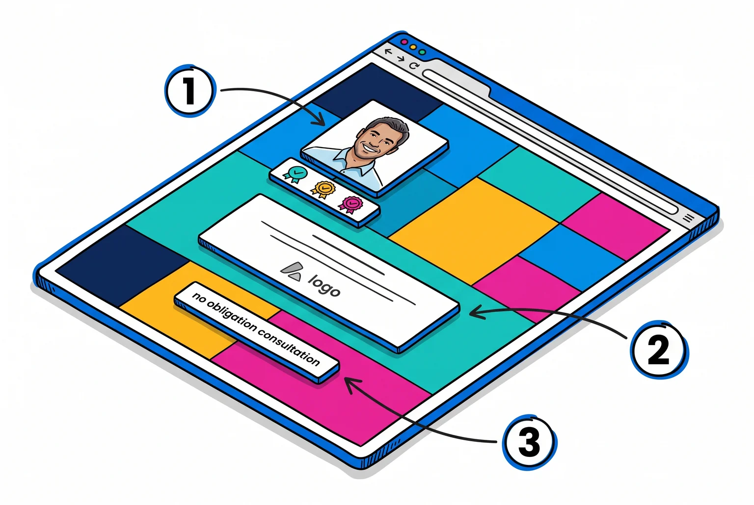
Those signals generally fall into a few categories. Social proof includes client testimonials, named case studies, and third-party recognition. Humanized expertise includes advisor bios, photos, and clear statements about who the firm serves. Credentials and regulatory transparency covers designations, BrokerCheck links, and professional memberships. Security and compliance signals include privacy policies and clear data-handling language. Professional usability is the baseline: clean design, fast load times, working navigation, visible contact information. And transparent process and fees means spelling out what a consultation involves and what it costs before someone has to ask.
That last category does specific work. A clear description of the advice process and consultation pathway reduces the uncertainty a prospect feels about what happens after they hand over their contact information. Similarly, framing a first meeting as a no-obligation consultation lowers the perceived risk of reaching out at all.
Quick definition: trust signal. Any element on a page, visual or written, that gives a visitor evidence the firm is legitimate, competent, and safe to engage with, before they've spoken to anyone.
None of these signals substitute for real qualifications. A well-designed page can make a mediocre advisor look more credible than warranted, which is part of why regulators pay close attention to how advisor sites present testimonials and credentials, a topic the next section covers in more detail.
What regulators expect from RIA website content
The trust signals that make a site convert, testimonials, credentials, client stories, are the same elements regulators watch most closely. For registered investment advisers, the SEC's Marketing Rule (Rule 206(4)-1) allows testimonials and endorsements on a website, but only under specific conditions, and those conditions affect design decisions, not just legal fine print.
A testimonial generally means a current client describing their experience with the firm. An endorsement generally means a non-client, an influencer, blogger, or third-party reviewer, recommending the advisor or describing a referral relationship. Both categories can appear on a website, but the rule requires clear and prominent disclosure covering whether the speaker was compensated, the material terms of that compensation, and any conflicts of interest. A five-star Google review widget and a written client quote on the homepage can both trigger these disclosure obligations depending on the facts.
If a promoter, paid or unpaid, has a disqualifying event on record, such as certain securities fraud convictions or SEC orders, the adviser generally cannot compensate that person for endorsements. Compensated arrangements typically call for a written agreement and adviser oversight of what's being said.
Performance claims carry their own requirements. Non-private-fund performance generally needs to be shown across 1-, 5-, and 10-year periods (or since inception) with equal prominence, and hypothetical or backtested numbers require explanation of the assumptions and limitations behind them. A stray "our clients average 12% returns" line on a services page is the kind of claim that draws scrutiny.
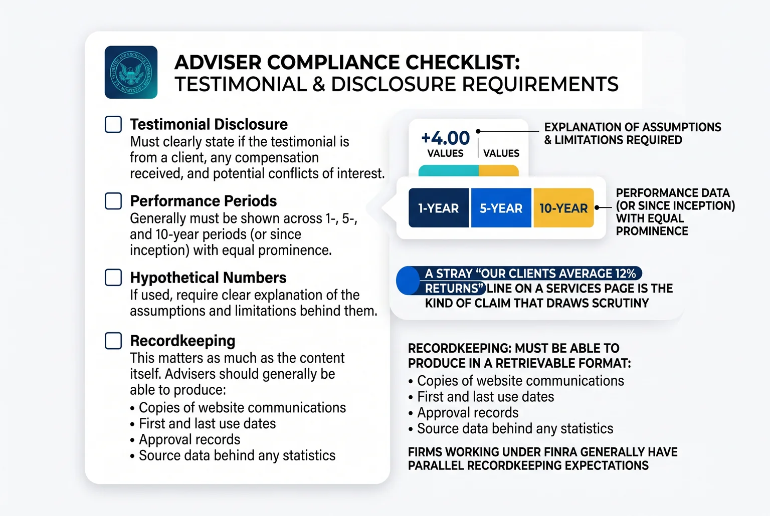
Recordkeeping matters as much as the content itself. Advisers should generally be able to produce copies of website communications, first and last use dates, approval records, and the source data behind any statistics, in a retrievable format. Firms working under FINRA generally have parallel recordkeeping expectations for public-facing communications, though the specifics depend on the firm's registration status.
None of this is a substitute for legal review. Compliance obligations vary by registration type, state rules, and firm policy, so advisors should treat this as a starting checklist to bring to their own compliance or legal team before publishing testimonials, reviews, or performance data on a live site.
Choosing between a template platform and a custom build
Once the compliance groundwork is in place, the next decision is structural: build on an advisor-focused template platform or commission a custom site from the ground up. Neither answer is right for every firm. The choice depends on budget, growth stage, and how much the website needs to carry the firm's lead generation strategy.
Advisor-specific template platforms such as FMG and Twenty Over Ten are built around the industry's compliance and content patterns, often running $178 to $1,044 per month with setup fees on top. DIY builders like Wix or Squarespace go lower still, sometimes starting at $16 to $159 per month, which explains why many solo advisors start there. Custom builds sit at the other end, typically requiring $3,000 to $100,000+ upfront depending on complexity, integrations, and branding work, with professionally designed advisor sites commonly landing in the $5,000 to $10,000 range for a mid-complexity project.
The tradeoffs go beyond price. Templates launch faster and reduce implementation effort because they come with prebuilt disclosure patterns and industry-standard layouts. That same standardization is the limitation: many advisor firms end up with visually similar sites, which can blur differentiation in a crowded search results page. Custom builds give firms control over information architecture, niche messaging, and lead-generation funnels tailored to a specific client type, and they're often perceived as more institutional and credible, a factor that matters when the target audience is high-net-worth prospects evaluating several firms at once.
Technical performance is another divide. Custom-coded sites frequently hit load times under 1.5 seconds with strong Core Web Vitals scores, while template and builder-based sites often run 3 to 5 seconds with lower pass rates and higher bounce, according to one analysis of coded versus templated builds. Templates also tend to offer only basic SEO controls, while custom builds allow deeper work on site architecture, structured data, and page-level optimization, at the cost of needing more ongoing technical oversight.

For a newer practice testing its market fit, a template may be the sensible starting point. For an established firm treating its website as a primary growth channel, the custom investment is more likely to pay for itself.
Turning layout decisions into booked consultations
Whichever platform an advisor chooses, the design elements on the page determine whether a visitor takes the next step. A handful of principles apply consistently to financial-services sites.
Build a CTA hierarchy, not a single button. The primary action should be a consultation offer, worded specifically: "Schedule a Free Consultation" or "Schedule a Call" outperforms vague labels like "Contact Us" or "Learn More," according to guidance from BankBound and Indigo Marketing Agency. Secondary CTAs give less-ready visitors a lower-commitment option: a retirement guide download, a webinar signup, or a newsletter subscription. These lead magnets, such as "Download Our Retirement Planning Guide" or "Join Our Webinar on Investment Strategies," capture contact information from prospects who aren't ready to talk yet but may be in three months.
Structure pages around a single audience or service rather than one generic services page covering everything. A prospect landing on a page built for "pre-retirees within five years of retirement" converts better than one reading a broad overview, because the copy can answer "is this for someone like me" within seconds.
Keep contact and scheduling paths persistent. Phone number, email, and a booking link should appear in the header, a sticky nav element, and the footer, not buried on a standalone contact page.
Consider fee transparency. One benchmarking study cited by XY Planning Network found that RIAs displaying fees on their services page report roughly double the conversion rate of firms that don't.

Mobile experience and load speed matter for a different reason than on typical e-commerce sites: a slow or clunky mobile page reads as a signal of low institutional competence to someone deciding who will manage their retirement savings. Industry guidance generally points toward sub-three-second mobile load times, though specific conversion-lift figures per second of delay aren't well established for this sector and should be treated as directional rather than exact.
Common mistake: overloading the homepage with disclosures and disclaimers, stacked above the fold, with no visual hierarchy separating legal text from the actual offer. Necessary disclosure language can sit in a footer or a clearly labeled section rather than competing with the CTA for attention. Confirm placement and wording with your compliance team before publishing.
Maintaining the Site After Launch
A launch date is not a finish line. Advisors who treat the site as done tend to see initial traffic and lead flow flatten within a few months, because the pages stop answering new questions and search rankings favor sites that keep publishing.
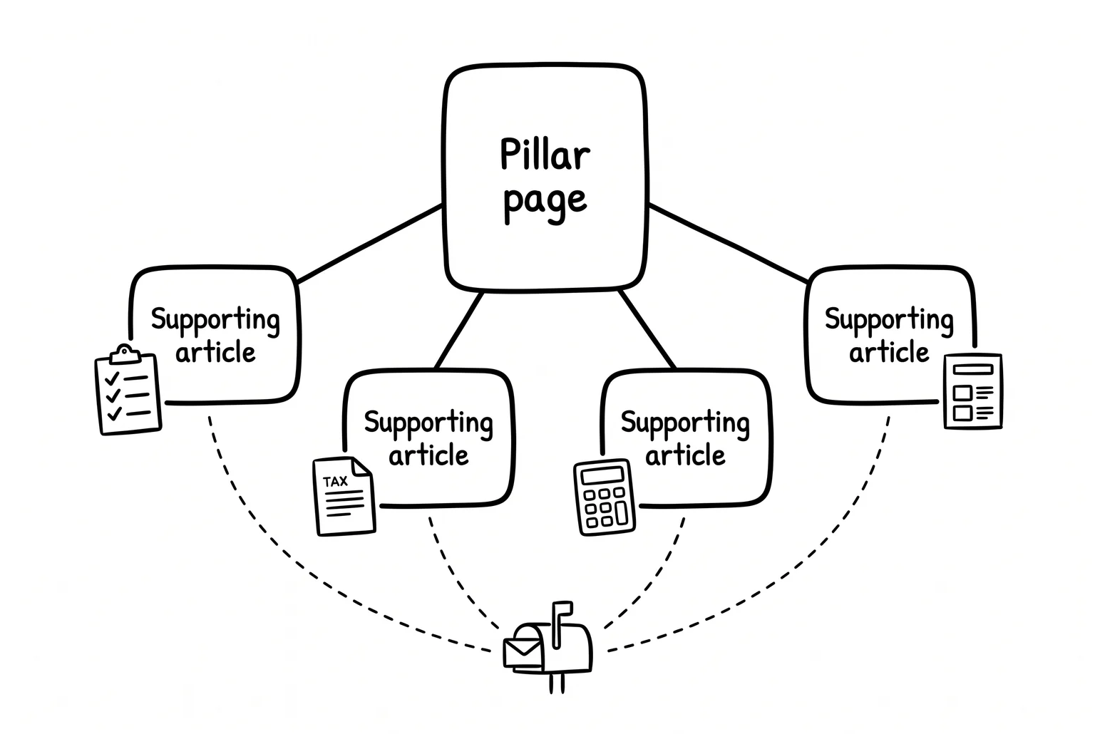
A sustainable content program looks less like sporadic blog posts and more like a structured hub-and-spoke model: pillar pages on core topics (retirement income, tax planning, estate strategy) linked to focused articles that answer specific client questions, in the range of one to four new pieces a month with periodic updates to older content. Local service pages, built around the metro areas an advisor actually serves, support this same effort.
Every piece of content needs somewhere to send the reader. Pair educational articles with a specific lead magnet, a retirement income checklist, a tax-planning guide, a short calculator, so visitors who aren't ready for a call still leave contact information behind.
None of this replaces analytics. Conversion tracking by source and campaign shows which pages and offers actually produce consultation requests, not just traffic. Review that data on a set schedule, quarterly at minimum, and treat the site as a system that improves with attention rather than a project that ends at handoff.
Common questions before you commit
How long does a redesign actually take? Most custom financial advisor website projects run 8 to 12 weeks from kickoff to launch, with more complex firms needing 12 to 16 weeks. Content approval and compliance review are the most common causes of delay, so faster turnaround from your side speeds up the whole timeline.
Can a template still convert well? Yes, if the copy and lead capture are done right. Templates limit design flexibility and load-time performance, but a well-built template with clear calls to action will outperform a slow, unfocused custom site.
How do I involve compliance without slowing everything down? Loop your compliance contact in early, at the wireframe stage, not after copy is finalized. Reviewing testimonial language, disclosures, and performance claims before design work locks in avoids rebuilding pages later.
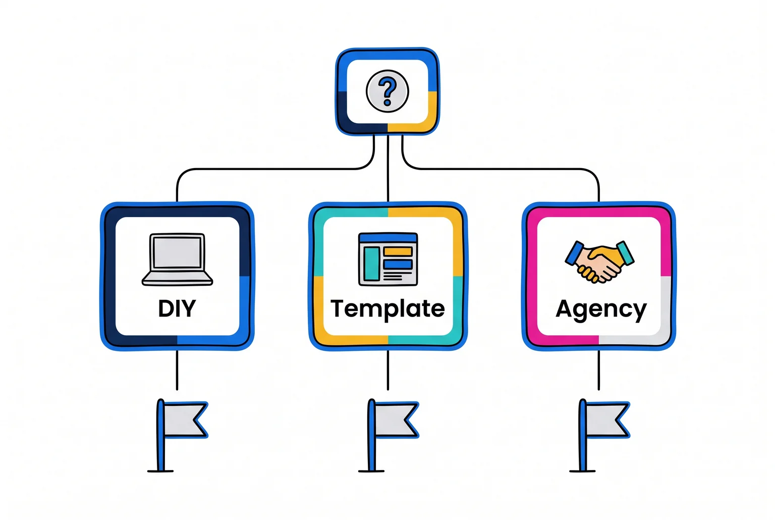
DIY, template platform, or agency? DIY and templated platforms work for advisors on tight budgets who can commit time to upkeep. A specialist agency makes sense once lead generation, not just having a website, becomes the priority.
If you're unsure where your current site stands on trust signals, compliance readiness, or conversion basics, a focused review with someone who works in this space can clarify what to fix first. Confirm any compliance-related decisions with your own legal or compliance team before publishing changes.

ABOUT THE AUTHOR
Cullen Fischel is the lead designer at Pro Financial Design. So, if you’ve ever worked with us, you’ve worked with Cullen on strategy, design, and content creation for your project. Cullen’s got years of experience developing websites, brands, logos, lead magnets, digital marketing strategies, and social and email content for his clients. If you have any questions for him, just send us a message!
Contents

Want more financial advisor marketing tips and guides? Check out: