12 Financial Advisor Website Design Patterns That Build Trust, Mapped to Each Page
Financial advisor website design patterns for each page: Home, About, Services, Fees, Contact, and Resources, with compliance flags for the SEC Marketing Rule.
Updated: 10/27/2026 by Cullen Fischel

A referred prospect checks your website before they book
A physician gets your name from a colleague, opens a browser, and types it in. What they find in the next few seconds, a dated page or no page at all, can decide whether the call ever happens. A 2025 Wealthtender study of 500 U.S. households earning over $100,000 found that 96% would research an advisor online before hiring, even after a personal recommendation, and 72% would visit the advisor's website. Since referrals account for 54.2% of new advisor clients, most of your best leads arrive already warm and then check you out.
Trust on that visit comes from structure, language, and where you place proof. Visual novelty adds little. Older research on web credibility, including a 2002 Stanford study and a 2006 Carleton University study, found that people judge a site's look very quickly, so a clean, readable design clears the first hurdle. After that, visitors need to see who you serve, how you are paid, and what happens next.

This post gives you 12 patterns, each tied to a page: Home, About, Services, Fees, Contact, and Resources. They are meant to sit inside the design you already have, so none of them requires a rebrand or copying another firm's look. Compliance flags appear where a pattern carries risk under the SEC Marketing Rule.
Key points:
- Prospects who receive a referral still tend to vet you online first.
- Each pattern names the page where it belongs and what to add or change.
- Fees, credentials, and testimonials need compliance review before they go live.
- You can start with three patterns rather than all twelve.
One running example appears throughout: a solo fee-only advisor who serves physicians within ten years of retirement. Her site has a generic headline, a stock photo, and a contact page with no explanation. Each pattern shows what changes for her.
A website also works beyond referrals. In a 2024 study, Ficomm found that 45% of consumers who hired an advisor chose based on digital marketing, though that figure comes from one survey and your results may differ.
Use the checklist to fix three pages, not rebuild the site
Every pattern in this post lists four things: the page or section where it goes, what to add or change, the reason it helps a prospect decide, and a compliance flag where the pattern touches fees, credentials, or testimonials. Nothing here depends on a particular design, so you can apply it to whatever site you have now.
To pick your first three, audit your site in this order:
- Open your home page on a phone. If a stranger can't tell who you serve and what to do next within a few seconds, start with the home page patterns.
- Look for the questions prospects ask before booking: how you are paid, what the first call covers. Missing answers point to your Fees and Contact patterns.
- Check where your proof sits. Credentials or reviews buried on a separate page point to a proof-placement pattern.
Choose the three gaps that are cheapest to fix and most visible to a referred prospect.
Platform choice does not change which patterns apply. If you are comparing website builders and providers, these are the cost shapes, as of October 2026:
| Option | Typical cost | Tradeoff |
|---|---|---|
| DIY builder | Squarespace plans run $19 to $99 per month on annual billing | Low cost and full control, but you write the copy and handle compliance wording yourself |
| Advisor-specific platform | Snappy Kraken starts at $99 per month plus a $499 setup fee; Twenty Over Ten's Voya plan is $129 per month plus $500 setup | Built for advisors, but monthly fees continue and templates limit layout changes |
| Custom agency | Custom Webflow projects for advisors start around $5,000, with creative retainers from $2,000 per month | Most flexibility, with the highest upfront and ongoing cost |
Prices vary by plan and billing term, and FMG Suite quotes websites individually. If you are weighing template against custom, a guide on professional financial advisor website design covers that decision.
For our running example, the solo advisor with the generic headline needs her home page headline, her Fees explanation, and a first-call description on Contact. All three are text edits she can make in any of the options above.
Three home page patterns that tell a referred prospect they are in the right place
Each pattern goes on the home page, in the first screen or just under it. The running example is a solo fee-only advisor serving physicians nearing retirement.
Pattern 1: A headline that names who you serve and the outcome
Page tag: Home page, headline.
Write one sentence that names the client group and what you do for them. Altfest's physician page uses "Comprehensive integrated financial planning and investment management for physicians" and states its fee-only fiduciary status since 1983 nearby. A physician knows within one line that the page is for them, and the sentence describes the service without a superlative. For our example, "Retirement planning for physicians within ten years of stepping back from practice" does the same job.
Mistake to avoid: "Your trusted partner for a brighter financial future" fits any advisor, so it tells a prospect nothing.
Pattern 2: One primary call to action above the fold
Page tag: Home page, first screen.
Offer one next step, worded as the action itself, such as "Schedule a 30-minute introductory call." BankBound and Indigo Marketing Agency advise that specific button wording beats vague labels like "Learn more." The case for a single prominent CTA comes from general landing-page material, not advisor sites, so test it against your own analytics. Secondary navigation links can stay.
Mistake to avoid: Three equal-weight buttons (book a call, download a guide, subscribe) ask a first-time visitor to choose before they trust you.

Pattern 3: A credentials and affiliations strip near the first CTA
Page tag: Home page, directly beside or below the CTA.
Place a single line of facts where the prospect decides whether to click: "CFP® professional. Fee-only. SEC-registered investment adviser." These terms describe different things, so list only those you hold and keep each distinct. For our example, add the founding year if it is accurate.
Mistake to avoid: A row of unexplained badges. Awards and affiliations are not proof of quality, and the SEC's risk alert says advisers should retain support and give context for third-party ratings or accolades.
Compliance note for all three
The Marketing Rule bars advertisements from including untrue statements of material fact or omitting facts needed to keep a statement from misleading. Terms such as "fiduciary," "fee-only," and "independent" must match your actual status and should not imply better returns or lower risk. Skip claims like "best advisor for doctors," which you would need to substantiate on SEC request. Have your compliance reviewer approve the headline and strip wording before you publish.
Three About page patterns that put a person and a plain answer on the page
Each pattern goes on the About page. The running example is still the solo fee-only advisor serving physicians nearing retirement.
Pattern 4: A client-first origin story
Page tag: About page, opening section.
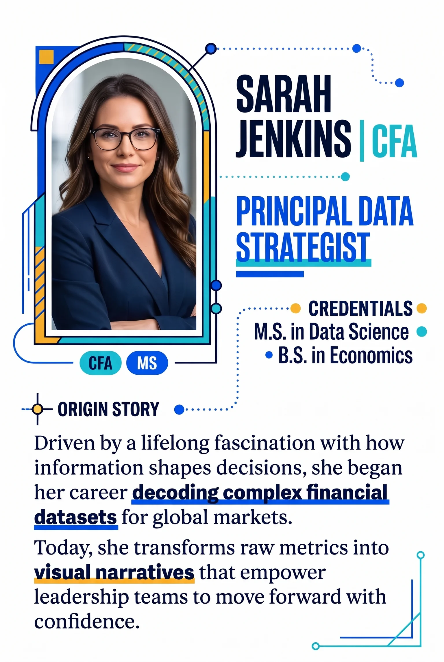
Start with the need that led you to the work, then your background. Altfest's About page says founders Lew and Karen Altfest created the firm so middle- and upper-middle-income households could get planning resources once reserved for the wealthiest clients. The story explains who the firm exists for before it says anything about the founders. For our example: "After watching physician colleagues reach their last years of practice without a plan for the income gap, I built a firm for that decision."
Pattern 5: Fiduciary status and pay, in plain English
Page tag: About page, directly under the story.
Say whether you act as a fiduciary and how you are paid, in two or three sentences. Altfest states that it is a fee-only fiduciary, takes no commissions, and sells no financial products. The SEC describes fiduciary duty as a principles-based obligation covering the whole adviser-client relationship, so your wording should match your Form ADV and client agreement. If you have a public site, link your current Form CRS prominently instead of paraphrasing it.
Pattern 6: Real photography and a named person
Page tag: About page, beside the story.
Use a real portrait with your name, title, credentials, and one detail tied to how you work. Nielsen Norman Group's research on photos as web content supports photos as carriers of information. It does not show that professional photography alone raises trust or leads, so treat the portrait as identification, not a conversion tactic.
Compliance note
Awards and rankings need more care than bios. The Marketing Rule allows a third-party rating only when process and disclosure conditions are met, and the disclosures must appear with the award, not only in a distant footer. Fees paid to participate in or license a ranking must be disclosed, and may trigger endorsement provisions. Send your fee and fiduciary wording to compliance too.
Two pages that answer "is this for me" and "what will it cost"
Pattern 7: A services page organized by client situation
Page tag: Services page, top section.
Lead with who you serve and the decisions they face, then list services under each situation. BMO's GSA Group client page sorts by retirees, professionals and executives, business owners, and physicians, and ties each to planning needs. Westmark's home page describes physicians from medical school through retirement and business owners focused on protection, cash flow, and exit planning.
For the running example, a physician block might read: "Nearing retirement from practice: income timing, partnership buyout, Medicare, and tax planning for the first five years." Investment management appears as one line item inside that situation.
The tradeoff is length. Give each situation a short block and link to deeper pages only for your core niche.

Pattern 8: Plain-language fee explanation
Page tag: Fees page, or a fees section on Services.
State what triggers each fee, how and when it is billed, what is included, and which costs are excluded, such as custodian or fund expenses. The SEC's Form ADV Part 2 instructions call for plain English fee descriptions, including whether fees are negotiable.
For our example: "Planning fee of a stated amount for the initial retirement plan, then an annual fee of a stated percentage of assets we manage, billed quarterly." Use your actual figures.
Range publishes three flat annual tiers at $3,950, $5,950, and $12,500 with no asset-based fee. Wells Fargo Advisors describes its fees as generally asset-based, with planning fees that depend on complexity but publishes no planning amount.
Published numbers can reduce uncertainty. In a 2026 TransUnion survey, 56% of investors said clear fee communication was a leading factor in whether they trusted a firm. Public prices can also invite comparison on cost alone, so put the scope of service beside any range you publish.
Compliance note
Keep every fee statement consistent with your current Form ADV Part 2A, Item 5. Fee illustrations, hypothetical savings, or performance references can trigger Marketing Rule requirements, so send the page to compliance before it goes live.
Where to put proof, and what to use when you can't
Pattern 9: Proof beside the decision point
Page tag: Home page and Contact page, next to the booking button.
Place one piece of proof within sight of the call to action, where a prospect decides whether to book. That could be a client quote, a credential line, or a review summary. DiverseKit suggests putting testimonials near the "Book a consultation" button and keeping required disclosures visible.
The SEC permits testimonials, endorsements, and third-party ratings under the Marketing Rule when disclosure, oversight, and disqualification conditions are met. In plain terms:
- Disclose whether the speaker is a client, whether they were compensated, and any material conflicts.
- Make the disclosure clear and prominent where the quote appears, not behind a tooltip or a separate policy page.
- Have a reasonable basis to believe the testimonial complies, and oversee any paid promoter.
- Expect a written agreement with promoters paid more than $1,000 in 12 months, unless they are affiliates.
- Do not pay anyone you know, or should know, has a disqualifying event.
A star rating or review widget carries the same obligations as a written quote, so each one needs its disclosure beside it. A third-party rating also requires due diligence, which the SEC's June 2023 risk alert listed among common compliance failures. If your firm cannot support a widget, drop it. Your compliance professional should approve wording, placement, and disclosure before launch.
Pattern 10: Process-based proof
Page tag: Contact page and the home page CTA area.
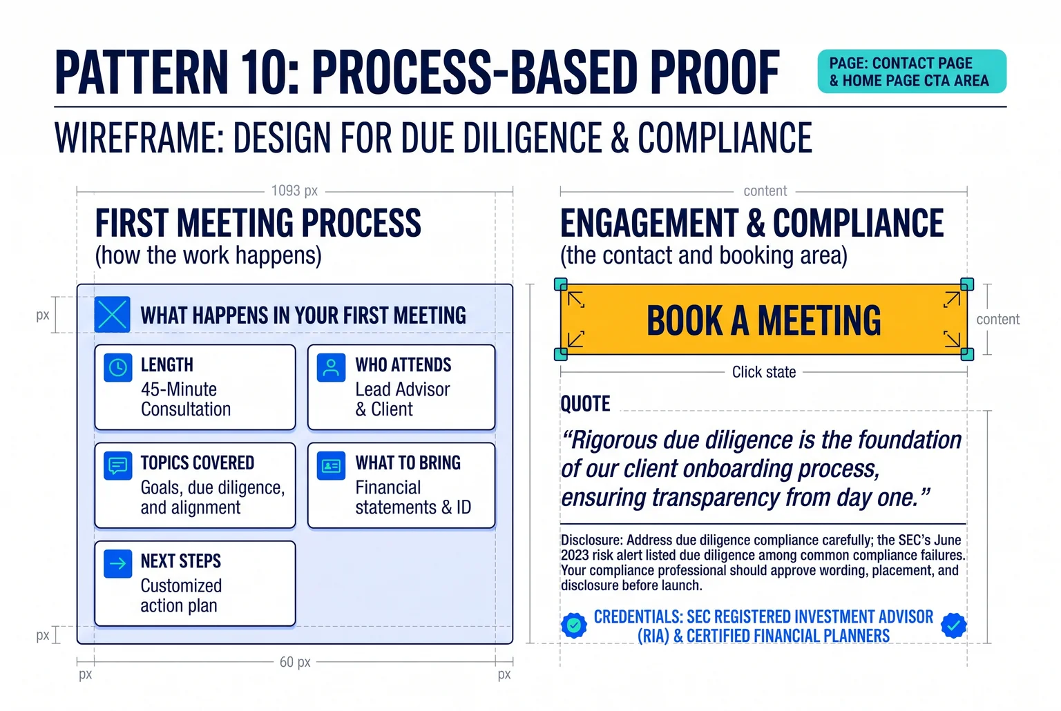
When testimonials are limited or risky, show how the work happens. A short "what happens in your first meeting" block can state the length, who attends, topics covered, what to bring, and next steps. SmartAsset recommends placing it near the booking decision.
For the running example: "A 30-minute video call with Dr. Lee's planner. We review your retirement timeline and practice buyout, you leave with a list of open questions, and no documents are required."
Sample planning deliverables, a fee explanation, and security practices work the same way. Keep each statement factual, avoid describing client outcomes, and send the block through compliance review like any other advertising copy.
A contact page that sets expectations, and a resource that earns the email
Pattern 11: Contact page that previews the first call
Page tag: Contact page.
Tell visitors what happens after they submit. J.P. Morgan tells prospects that a team member will call shortly to gather information and find the right advisor fit. Add the length, the topics, and what to prepare. Oak Road Wealth describes introductory consultations as typically 30 to 60 minutes covering goals, fees, services, and fit.
For the running example: "A 30-minute call to review your retirement timeline. Bring a rough list of accounts and your target retirement year. Dr. Lee replies within one business day."
Keep the form to name, email, and one open question. Longer forms are not automatically worse: a 2025 benchmark found top performers converting above 76% with 13 fields and above 77% with two. Ask only for what the first call needs, and link a current privacy notice beside the button.
Pattern 12: A resource tied to one client concern
Page tag: Resources page.
Offer one resource for one worry, such as a "Retirement timing checklist for physicians" covering practice sale, partnership buyout, and benefits deadlines. KAV Solutions' checklist opens with reviewing monthly cash flow, a concrete first step. Follow the download with a short email pointing to the same booking button.

Compliance notes
- Rule 204-2 recordkeeping can cover website materials and lead-form communications. Records are generally kept at least five years. Keep dated copies of pages, approvals, and source data for any statistic.
- Regulation S-P amendments require an incident-response program and, with limited exceptions, notice within 30 days of learning of unauthorized access. Larger firms were due December 3, 2025, smaller firms June 3, 2026. Review your form vendor's retention, breach-notification, and deletion terms.
- Marketing emails need a physical address and an opt-out honored within 10 business days, per the FTC's CAN-SPAM guide.
Every page ends with the same next step: book the 30-minute call.
Audit your site in one sitting: the 12-pattern checklist
Open each page below in turn and check it against the patterns listed beside it. Patterns 9 and 10 appear on more than one page, so look for them wherever a booking button sits.
| Page | Patterns | What to look for |
|---|---|---|
| Home | 1, 2, 3, 9, 10 | A headline that names your niche, one primary call to action, a credentials strip beside it, and one piece of proof or a first-meeting summary near the button |
| About | 4, 5, 6 | A client-first story, your fiduciary status and how you are paid in plain English, and a real photo with your name |
| Services | 7 | Services organized by client situation instead of a product list |
| Fees | 8 | A plain-language explanation of what triggers each fee, how it is billed, and what it covers |
| Contact | 9, 10, 11 | Proof beside the booking button, a description of the first meeting, and a short form with a preview of the first call |
| Resources | 12 | One resource tied to one client concern, with a follow-up email that points to the booking button |
Prioritize in this order:
- Fix the home headline and call to action first, since every visitor sees them.
- Add your fee explanation and your fiduciary and pay statement next, because these answer the questions prospects hesitate over.
- Place proof and a first-call preview beside the booking button.
- Add the About page story, photo, and resource once the pages above are in place.
Results vary, and no pattern guarantees more inquiries.
FAQ
Does compliance need to review changes? Route website claims through your firm's compliance process, especially fee statements, credentials, testimonials, and ratings. The SEC's Marketing Rule has applied since November 4, 2022. This is not legal advice.
Can a template work? Often, since these patterns change content and structure more than design. A template with editable headline, button, and page sections can hold all twelve.
How long do upgrades take? Planning ranges run 2 to 6 weeks, longer with compliance review. Text changes to a headline or fee explanation usually move faster than a new page.
Next step: audit your site against this checklist, then bring the top three gaps to your compliance review.

About Cullen Fischel
Cullen Fischel is the lead designer at Pro Financial Design. So, if you’ve ever worked with us, you’ve worked with Cullen on strategy, design, and content creation for your project. Cullen’s got years of experience developing websites, brands, logos, lead magnets, digital marketing strategies, and social and email content for his clients. If you have any questions for him, just send us a message!

Want more financial advisor marketing tips and guides? Check out: