Financial Advisor Web Design: Fix Your Homepage, Proof, and Pages
Financial advisor web design guide: rewrite a cluttered homepage, build proof that fits the SEC Marketing Rule, and plan your pages.
Updated: 10/27/2026 by Cullen Fischel

Why advisor homepages lose visitors before they scroll
A prospect lands on an advisor's homepage and has to work out who the firm serves, what it does, and what to do next. Many don't bother. In financial advisor web design, clarity usually matters more than visual polish, because a plain page that answers those three questions can outperform a beautiful one that doesn't.
Nielsen Norman Group reports that users often leave web pages within 10 to 20 seconds, and that the first 10 seconds largely decide whether they stay. That research covers web use in general, not advisor sites specifically, but the pattern is a useful guide.
Key points
- Visitors may decide within about 10 seconds whether a page is worth their time.
- A homepage often needs to name the audience, the problem, and one next step in that window.
- Vague headlines, stock photo sliders, and several competing buttons can slow that decision.
- Proof, such as credentials and a described process, gives a hesitant visitor a reason to stay.
Meet the example advisor
Consider an illustrative independent advisor who works with people five to ten years from retirement. The homepage opens with a headline like "Your Future Starts Here," a slideshow of smiling couples on beaches, and five buttons: Contact, Learn More, Our Services, Get Started, and Free Resources. There are no credentials, no description of how the firm works, and no client feedback.

Each choice looks harmless alone. Together they make a pre-retiree guess. A headline of that kind fails to identify the client or the problem, and a generic label like "Contact" does not say what happens next. Competing buttons can dilute attention and create uncertainty, and in one benchmark of financial-services sites, only 32% used specific calls to action.
The next section rewrites this page element by element.
Rewriting the above-the-fold area, one element at a time
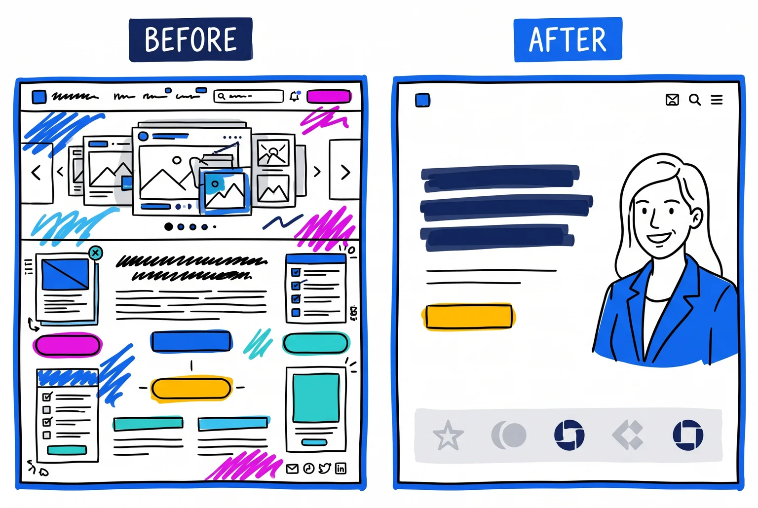
The rewrite follows the order a visitor reads: headline, audience, next step, proof. Each change shortens the time it takes a pre-retiree to decide whether this advisor is for them.
Quick Definition: above the fold. The part of a page visible before scrolling. NN/g advises putting the most critical content there.
1. Headline
- Before: "Your Future Starts Here"
- After: "Retirement planning for people 5 to 10 years from retiring"
A headline should name the client and the outcome. NN/g recommends a descriptive tagline that states the site's purpose and distinctive value. When visitors must work to decide whether they are in the right place, they grow suspicious and may leave.
2. Who it is for
- Before: Nothing. The slideshow shows couples on beaches.
- After: "I help pre-retirees turn savings into an income plan they can rely on."
The line repeats the audience and adds the outcome. A prospect who fits should recognize themselves in one read.
3. One primary call to action
- Before: Contact, Learn More, Our Services, Get Started, Free Resources
- After: One prominent button, "Book a 20-minute planning call," with other links quieter or lower on the page
In an analysis of 18,639 landing pages, pages with one call to action averaged a 13.5% conversion rate, against 11.9% for two to four links and 10.5% for five or more. That is an association, and landing pages differ from advisor homepages. NN/g separately advises against equally prominent competing calls to action.
4. Proof
- Before: None.
- After: A short strip beneath the button with credentials and a one-line description of how the firm works.
Visitors get a reason to trust the page before they commit to a call. The next section covers what that proof can compliantly say.
What you give up
The rewritten page is plainer. The slideshow goes, and so does some of the warmth it was meant to supply. Section 5 returns to where polish earns its cost.
The larger cost is the niche. A single-call strategy requires deciding whom the page is for and what outcome matters most. A focused headline can also discourage visitors outside that group, such as a 45-year-old or a recent retiree, who may assume the firm isn't for them.
What compliant proof looks like under the headline
The proof strip beneath the button has three jobs for the example advisor: show credentials, describe the process, and, if she uses them, present client voices. Each can be written plainly. Each should be reviewed before it goes live.
Credentials and process
A CFP designation or fiduciary status is a factual claim, so give visitors a way to check it. Link to the CFP Board's certification lookup and to the advisor's SEC Investment Adviser Public Disclosure page, and state the designation exactly as it is held. For process, a single line works: "Three meetings: review your finances, build an income plan, start implementing it." Keep it descriptive. Avoid promises about outcomes.
What the SEC Marketing Rule permits for testimonials
Rule 206(4)-1 permits testimonials and endorsements in advertisements if the adviser meets conditions for disclosure, oversight, written agreements, and disqualification. A testimonial is a client's statement about the adviser. An endorsement is a similar statement from someone who isn't a client, such as a referral partner.
Disclosures must cover whether the speaker is a current client, whether they are paid, and any material conflicts. Compensation terms must be disclosed as well. Advisers generally need a written agreement with paid promoters, unless the promoter is an affiliate or receives $1,000 or less over 12 months.
Unpaid does not mean exempt. Promoters receiving no or minimal compensation still trigger disclosure and oversight requirements. Third-party ratings may also appear if the required disclosures are given and the rating meets preparation criteria, which include showing its date, period, and issuer.
Common Mistake: Posting only the best reviews with no disclosure nearby. SEC examiners have observed missing or incomplete promoter disclosures, disclosures absent when the ad appeared, and overreliance on hyperlinks. Place the disclosure next to the quote.
Limits of this section
This is general information, not legal advice, and no wording is compliant just because it resembles an example here. The rule also covers organic content, so website copy and social posts both count. Review each asset individually, and keep records such as use dates and approval history. Confirm your testimonials, ratings, and disclosure placement with compliance counsel before publishing. The same review applies to the content plans in lead generation without paid ads.
The five pages a pre-retiree advisor's site needs
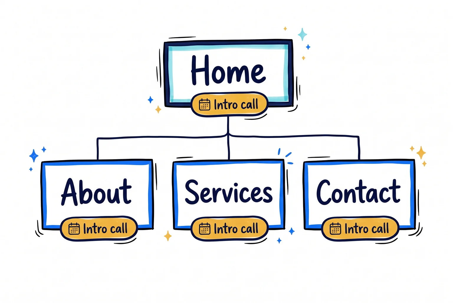
A typical advisor site has Home, About/Team, Services, Contact, and an intro-call button that follows the visitor everywhere. Put "Schedule an intro call" in the header and footer of every page, so each one points to the same next step. The best advisor sites are effective because of this structure, not because of their color palettes. Layline Financial, for instance, tells its services as a single narrative page.
Home: orient and qualify - Names the client (people five to ten years from retirement) - Explains the approach in plain language - Shows the intro-call button and contact options - Links required disclosures, such as where visitors can find Form CRS
About/Team: answer "Who will I trust with my money?" - Current, authentic headshots - Background, credentials, and role for each person - An intro-call link on each profile
Services: explain the help, not the product list - Organize by client need, such as turning savings into income - Describe the engagement process and who it suits - State any minimum assets - Use goals language ("we work toward," not "you will have"), since advisers should avoid guaranteeing outcomes like a secure retirement
Contact: make booking easy - Service area, phone, a monitored email, and office hours - An embedded calendar, which removes a step compared with a static form - A short note on what the first call covers - A minimal form: name, email, phone, one qualifying question
Keep credentials and fiduciary language next to the services and booking button where decisions happen, not only on the About page. Do not ask for account numbers or identity details on a public form. Point those to a secure client portal. Which disclosures apply to your firm is a question for compliance counsel.
Where design spending helps once the message is clear
Visual design works only after the rewritten homepage has done its job. A better photo cannot fix a vague headline. Once the headline, audience, button, and proof are settled, these choices decide whether the page feels credible.
Photography - Pay for professional photos where they show real evidence: the advisor, the team, the office. A Cornell Tech study of 300 participants found high-quality seller photos earned higher trust than poor ones, scoring about 3.8 against 3.4 on expectation fulfillment, with stock at 3.7. - Stock photos are acceptable as background. The gap between stock and high-quality photos in that study was small, and an NN/g study of 77 participants found AI-generated images were not rated less trustworthy than stock. - Our advisor's slider of generic retirees can go. One real headshot beside the headline does more.
Navigation - Keep the header compact: How We Work, Services, About, Contact, and the intro-call button. - Set client login apart from prospect links, as many advisor sites do, so existing clients find it without distracting new visitors.
Layout, type, and mobile - Use one layout pattern across pages, so visitors learn the site once. - Body text needs a contrast ratio of at least 4.5:1 against its background under WCAG 2.2. Contrast ratio is the measured difference in brightness between text and background. Large text needs 3:1. Pale gray on white often fails. - Check that the site works by keyboard alone and that the same content appears on phones. Pre-retirees browse on phones too.
The branding tradeoff
A template costs less and launches sooner, but its layouts limit how much of your process and personality fits. Custom branding removes that limit and adds cost and time. For a first redesign, a well-configured template with real photography usually gets most of the benefit. The professional website design guide covers what custom work adds.
How the site gets found and stays current
Search results for an advisor's site usually come from three things: pages that match what people type, accurate local information, and a site that loads quickly. Early movement often appears within 3 to 6 months, though timing varies and nothing here is guaranteed.
Match real searches. Combine a service, an audience, and a place, such as "retirement planner in [city]" or "financial planner for physicians." For our example advisor, that means a service page for pre-retirement planning and a location page only for areas the firm actually serves, each with local context rather than a swapped city name. Keep the Google Business Profile accurate, choose a category like Financial Planner, list specific services, and skip keyword-stuffed firm names, which risk suspension. Local rankings rest on relevance, distance, and prominence.
Titles and speed. Write a unique title of roughly 50 to 60 characters for each page, starting with the main keyword. Aim for a Largest Contentful Paint of 2.5 seconds or less, the point where the main content finishes loading.

A three-step cadence. One to four new pieces a month is sustainable.
- Publish one focused page on a pre-retiree question: Social Security claiming (full retirement age is 67 for anyone born in 1960 or later), 401(k) to Roth IRA conversions, or healthcare costs before Medicare at 65.
- Turn it into an email to your list and a section of a longer guide.
- Revisit older pieces each quarter and update them.
A small set of strong educational pages tends to beat a pile of generic posts. The digital marketing guide covers how these pieces feed lead generation.
Compliance and records. Have compliance review content before it goes live. Registered advisers must keep required records, including social media communications, easily accessible for at least five years from the end of the fiscal year in which they were created or last published. Keep approvals, edits, and supporting substantiation, and ask compliance counsel what your archive needs to capture.
What each website approach costs and how to compare providers
Prices vary widely, and the figures below are typical ranges reported for 2026, not quotes. The example advisor needs a clear homepage, a handful of pages, a booking link, and compliance review, so the useful question is what each option leaves for the advisor to do.
DIY builder. Plans run about $16 to $159 per month. Squarespace, for example, lists $25 to $139 per month. That covers the platform and hosting, but not copywriting, custom design, compliance review, or maintenance. A builder suits a new practice with a small budget and time to spare. Plan on days to a few weeks.
Template with customization. Advisor-specific platforms such as FMG and Twenty Over Ten often run $178 to $1,044 per month plus setup fees. FMG's all-in-one plan is reported at $178 per month plus a $994 setup fee. These platforms usually include compliance-oriented features and support. They fit an advisor who wants speed and accepts a fixed layout.
Fully custom with copywriting. Custom builds are reported from $2,500 to $150,000+, with timelines from one week to six months. TMN Creative offers three tiers, priced at $2,250+, $3,750+, and $5,000+, plus $100 per month for managed hosting. Pro Financial Design's webpro plan starts with a $750 down payment, then bills by the hour to complete the custom website design project.
Questions to ask any provider
- What is the total first-year cost, including setup and migration fees?
- Is copywriting included, and who writes for a pre-retiree audience?
- How does compliance review work, and how long does it add?
- Who owns the site and content if you leave?
- What recurring fees apply for hosting and maintenance?
Compare providers on those answers, not on the headline price.
A homepage self-audit checklist and common questions
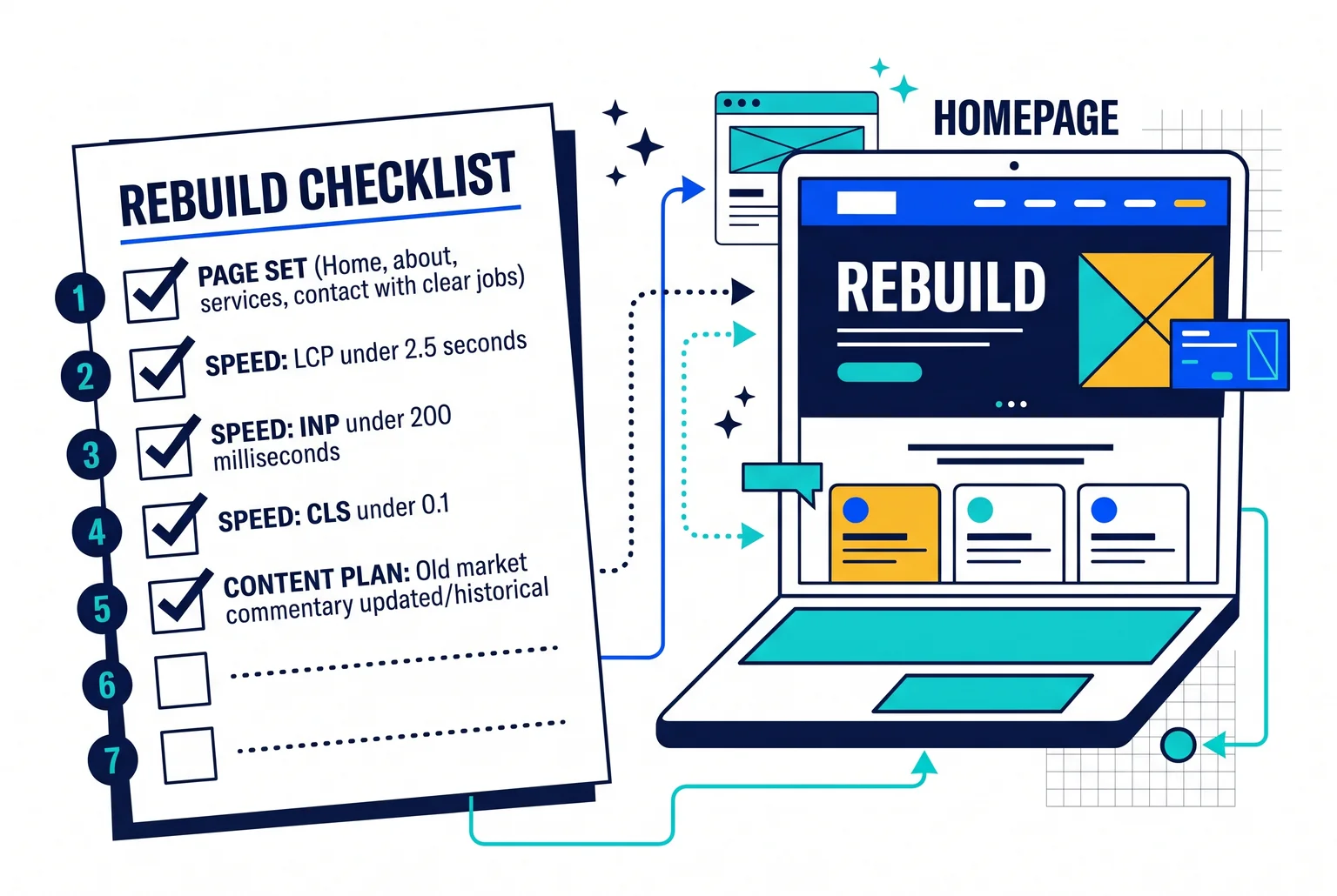
Open your homepage on a phone and a laptop, then work through these checks.
- Headline: A visitor can tell who you serve and what you do within a few seconds.
- Audience, services, fees: The page names your audience, services, and how you charge. Fee language matches your Form ADV.
- One call to action: One primary button, such as an intro-call link, repeats across the page.
- Compliant proof: Form ADV Part 2A, Form CRS, and BrokerCheck or IAPD links are current. Testimonials carry required disclosures, and no claim promises returns.
- Page set: Home, about, services, and contact each have a clear job.
- Speed: Core Web Vitals meet the good thresholds: LCP under 2.5 seconds, INP under 200 milliseconds, CLS under 0.1.
- Content plan: Old market commentary is updated or labeled historical.
FAQ
How long does a redesign take? Custom projects typically take 8 to 12 weeks, or 12 to 16 for complex firms.
Should I hire a specialist? A specialist helps if compliance review and copywriting are gaps. A builder can work for a new practice with time to spare.
How do I pick a provider? Use the five questions from the previous section and compare total first-year cost.
Next step
If several boxes stayed empty, a second opinion can save time. Request a homepage review from Pro Financial Design, and we will walk through these checks against your site.

About Cullen Fischel
Cullen Fischel is the lead designer at Pro Financial Design. So, if you’ve ever worked with us, you’ve worked with Cullen on strategy, design, and content creation for your project. Cullen’s got years of experience developing websites, brands, logos, lead magnets, digital marketing strategies, and social and email content for his clients. If you have any questions for him, just send us a message!

Want more financial advisor marketing tips and guides? Check out: